Behind the scenes of our rebrand

I had been feeling a pull toward renaming and rebranding for a bit but hadn’t come up with a name that resonated with me. On a long flight home, feeling a bit inspired from our travels, I started brainstorming name ideas again. The name Caminito stuck. With that name in mind, I pulled together a mood board that informed the direction for the rebrand:

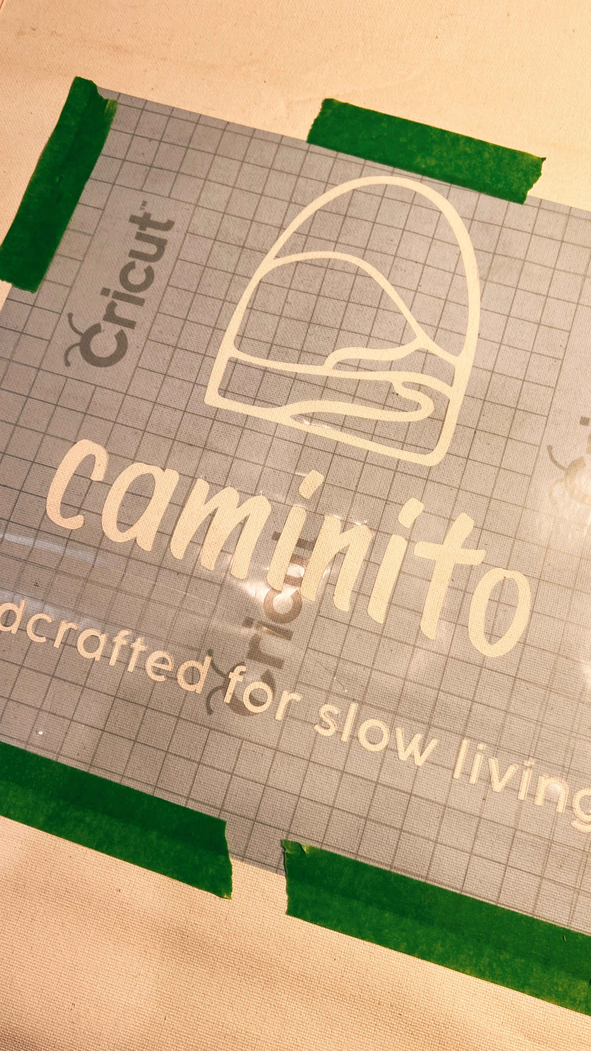
The next step was coming up with the logo and look of the actual type face. I didn’t want to stray too far from Nipomo’s look and feel so I started playing with iterations of the squiggle that had been our logo. Then went on to more literal interpretations of a path along a hillside. Once I landed on a rough shape I liked, I played around more with versions of the paths and hills, even some with colored areas (as you see in the top animated image). The final logo emerged and then the fun started - creating a color palette!


Using the mood board and the final logo iterations, the next step was pulling together a graphic direction for the new brand:

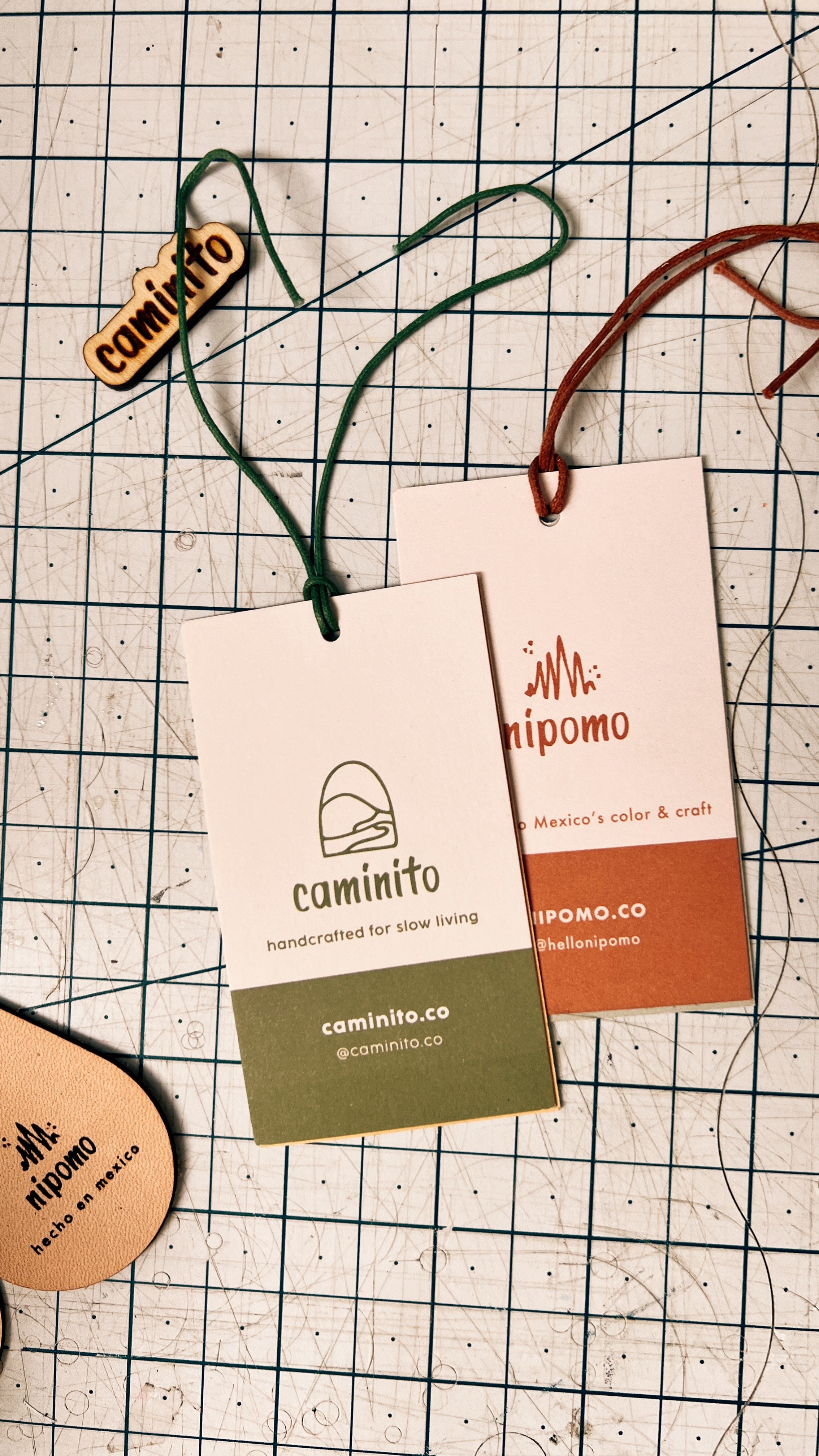
Next up we had to switch everything over to our new logo! From our leather basket tags, to our hangtags, postcards, and signage for our craft fairs.


And of course we also had to switch our packaging tape for our web orders! Luckily we use Sticker Mule and you can order as many sample strips as you’d like for only $4 each! We love being able to make sure our tape will look good on the cardboard boxes before committing to a larger order.


Once we got through all of the fun tasks (and non fun tasks i.e. URL forwarding, email authentication and business license updates…) it was so rewarding to see it all come together at our Pop Up Picnic club relaunch (more photos of that to come). As well as at our first craft fair of the year as our new brand.


Thanks for following along and let us know if you have any questions for us about the process!